Branding & Visual Identity
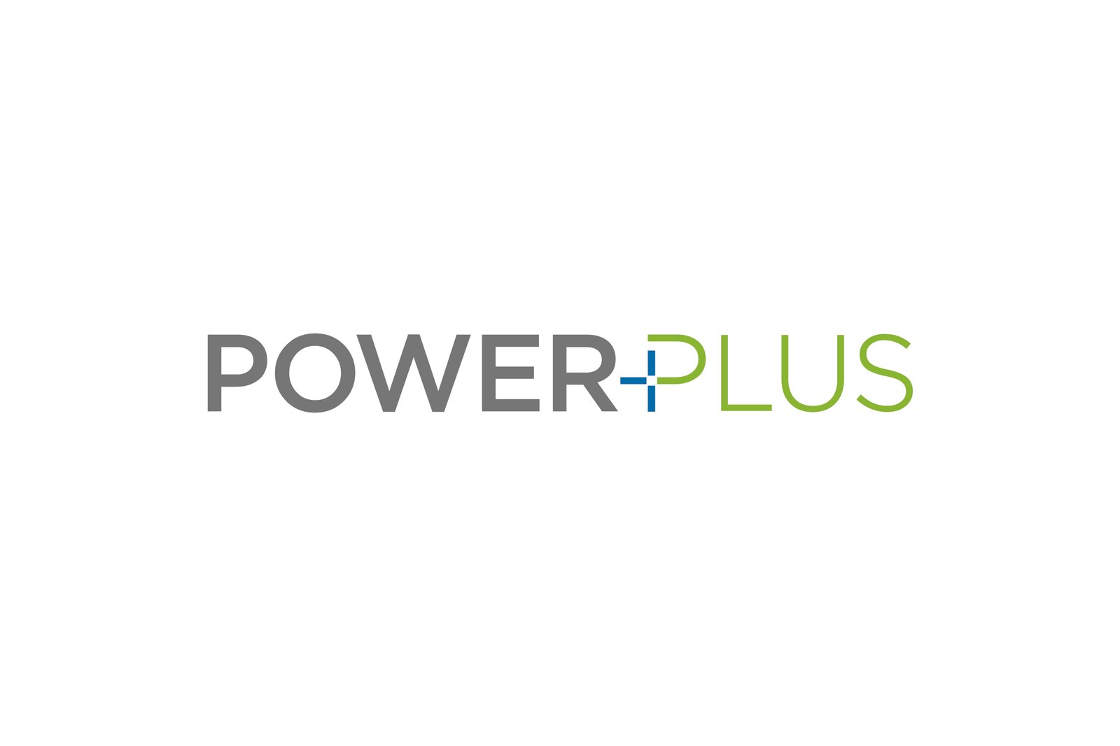
Power Plus
Power Plus is a line of Zero Net Energy (ZNE) homes for a local builder. After several rounds of options and revisions, the client landed on the subtle plus symbol separating the words to emphasize the company product offering.
The cool color palette evokes green earth + blue sky + gray corporate stability.
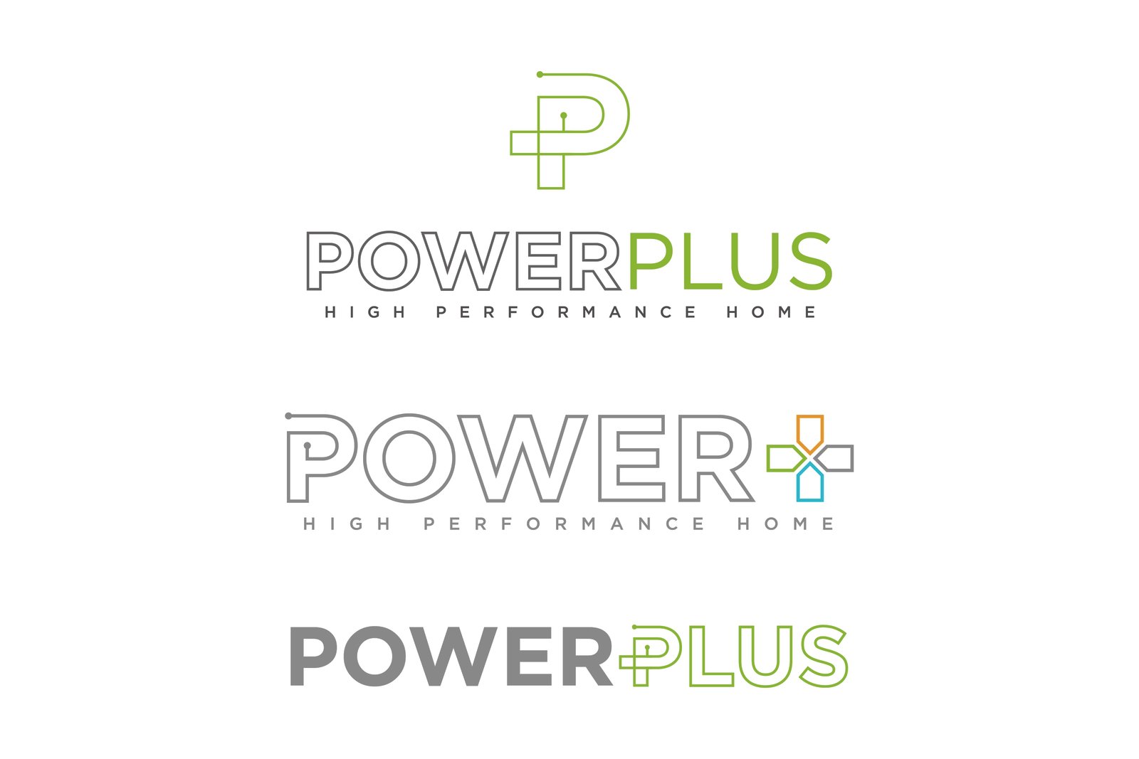
The unused concepts explore the idea of power cables and use
four home shapes to create a plus icon.